
Interview with Illustrator Antonio Caparo
Are you interested in drawing or becoming an illustrator? If so, you’ve come to the right place. Below you’ll find a conversation with the incredibly talented Antonio Caparo, the gentleman who created IMPYRIUM’s gorgeous cover. Read on to learn about Antonio’s training, his approach to making art, and where he looks to find technical guidance and inspiration. It’s a fascinating window into a professional’s vision and creative process. Thank you, Antonio!
1. Could you please tell us a bit about yourself and where we can find you?
I am an illustrator, graphic designer and comic artist (but I haven’t done too much of the latest in a long while).I was born in Cuba and now I live in Montreal, Canada.
2. How did you decide to become an illustrator? When did you realize that you had both the skill and passion to pursue art as a profession? Did someone encourage you, or was this a realization you came to on your own?
I have enjoyed drawing since I have memory but while studying graphic design at the Superior Institute of Design in Havana I found a book at the institute’s library of Masters of Fantasy Art including the works of Jim Burns, Boris Vallejo, Chris Foss and many more. That blew my mind up. I spent hours absorbing everything from its pages and started considering illustration as a profession at that moment.
3. What formal training did you receive? How important was formal training compared to what you learned on your own? Do you have any advice for aspiring artists who wish to develop their skills or portfolio?
I would say it was a 50/50 relationship. My first education in Arts started at the age of 12 at an elementary school of arts in my home town, Santa Clara, Cuba. Then I took my superior studies of Graphic Design in Havana. I had many good teachers of drawing and illustration there but since Illustration was not the main subject-matter in the institute I completed my studies on my own, reading a lot, drawing tirelessly. We had a semester of illustration techniques that included a brief course of pencils, watercolors and inks but at that time I had just discovered the works of many international comic artists (Moebius, Sergio Toppi, Will Eisner) and with the guidance of Luis Bencomo, a fabulous cuban comic artist and illustrator I spent many hours of my personal time developing some inking techniques that I couldn’t have achieve otherwise.
4. Do you have any influences? Any heroes whose work or technique inspired you?
Many artists but among the most important: Jean (Moebius) Giraud, Oscar Chichoni, N.C. Wyeth, Gustave Dore, Mike Mignola, Dave McKean, Shaun Tan, etc.
5. How would you describe your particular style? Did you consciously try to develop it, or did it simply evolve over time?
It was an evolution. My first illustrations were made in BW ink line-art in the style of Moebius. Eventually I started to add color, mostly watercolours until I discovered the digital tools and once there I realized one day that I was using a sort of crosshatching technique to achieve volume with a digital charcoal brush in Photoshop. Gradually I started to vanish the ink outlinefrom my work. On the last 5 or 7 years I have discovered a few 3D tools that I have ben incorporating into my 2D digital workflow like Vue Studio and Cheetah 3D.
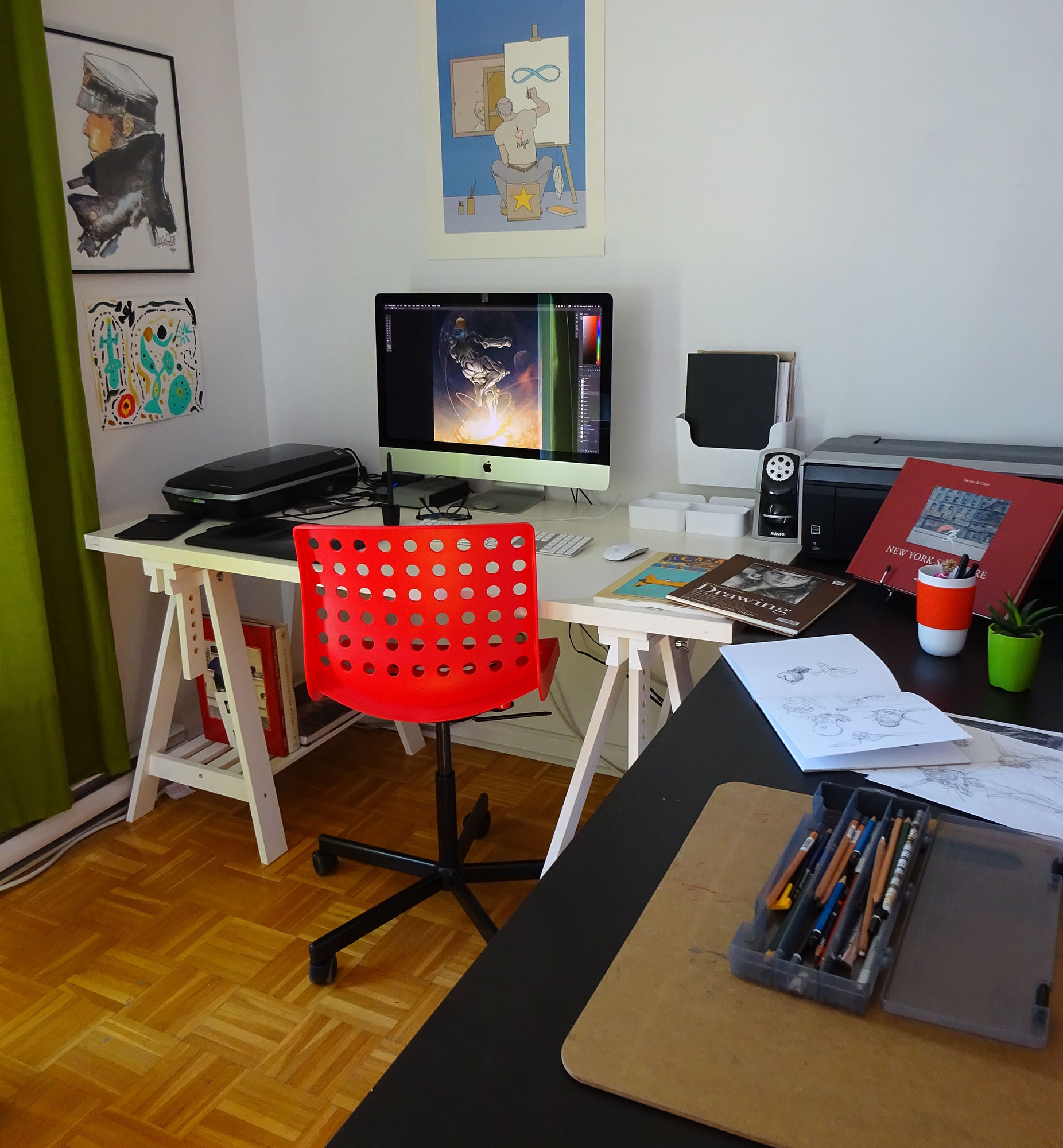 6. I’m always fascinated by people’s workspaces. Could you share a photo of your studio and tell us a bit about your favorite tools? If we wanted to tackle a project like Antonio Caparo, what should be on our shopping list?
A drafting table, graphite drawing tools, sketchbooks and drawing pads (various sizes), a desk, a 27” desktop computer, a Wacom tablet, a ton of art books and a mug of tea (coffee is for the afternoons). Also sketching is one crucial part of my workflow but that is done mostly outside my office at a coffee shop or public library. For that purpose a sketchbook, graphite pencils and ballpoint pen would do.
7. These days, it seems like many illustrators use the computer for some, if not all, of their workflow. How much of your work is done with traditional media, and how much is done on the computer? Do you use the computer for specific tasks, such as digital shading, or compositing? Do you utilize a drawing tablet or particular software?
Must of my workflow is digital except sketching which is done with paper and pencil. Sometimes if the project is visually complex I made a clean pencil line-art after a sketch has been approved that I scan and use as a reference to paint in Photoshop.
8. What else contributes to your creative productivity? Do you prefer to work at a particular time of day? Do you listen to music? What kind of environment do you need to be at your best? Do you have a fixed routine or take each day as it comes?
Most of the time I have a 9am to 5.30pm routine at my office except from those days when I sketch outside. I usually listen to music but when I am in the middle of a problem (like reorganizing my calendar to make 3 or 4 projects fit in the same time) I turn everything off and prefer silence. The truth is that I am more productive at night until 2 or 3 am but that would go against my family’s schedule so I prefer to limit those moments for emergencies or tight deadlines.
9. We often hear of “writer’s block” but I would imagine writers are not alone. Do you ever hit a creative wall? If so, how do you shake things up and recharge your batteries?
Getting out. Museums and galleries do the trick usually. But in those moments I prefer to see nothing on my line of work, an exhibition of photography or sculpture, or a movie help spark my imagination.
10. Where are your favorite places to look for inspiration? Do you have any favorite films or books? Museums or locations?
I read sci-fi and fantasy novels, comic books and love to see movies (in a theatre rather than at home). Among my recent favourite readings: ‘Revelation Space’ by Alastair Reynolds, ‘Leviathan Wakes’ by James S.A. Corey, ‘The Half Made World’ by Felix Gilman, ‘Joe Golem and the Drowning City’ by Christopher Golden and Mike Mignola. The Montreal Museum of Fine Arts is one of my favourite places to seek for inspiration too.
11. We often hear that people judge books by their covers, and that a great cover can make all the difference. In your opinion, what makes for a really great cover? Is it a design that stands out? An image that tells a story? A teaser that compels a shopper to pick the book up? What are your priorities when tackling a cover? Do they vary based on the book or audience?
It depends on the book, the target audience and the personal taste of readers. I made the same questions to me whenever I work on a project and then once it hit the bookshelves I try to find my book there and compare it to what it have around. There is a big difference between your image and the final product which includes type, paper, size, volume, things that do not depend on the work of the illustrator. I am always attracted to fully illustrated covers but when I picked ‘The Half Made World’ at a bookstore it was the simplicity of that catching title over a clean page with a tiny silhouette of a flying steampunk device that made the trick. So there is no way to say, the only thing that’s important is that the reader won’t be indifferent towards it.
12. What are some of your all-time favorite book covers and what makes them remarkable?
From the ones I can remember right now: I love the rough style and mysterious cat with a human face on the cover of ’Cages’ by Dave McKean, the floating futuristic feeling and attention to detail of Sam Weber for his cover of ‘Ender’s Game’, the intelligent and hypnotic eyes of the dragon in the cover of ‘Eragon’ illustrated by John Jude Palencar, the mystical futurism of Stephan Martiniere for ‘The Three Body Problem’. It’s good to note that in all of this examples type plays a key role alongside illustration creating a solid balance of elements.
13. Let’s talk a bit about IMPYRIUM’s cover. How was the book described to you, and how did you go about getting started?
As a big world that has a mix of magic, technology and royalty. Those three elements got my attention immediately. I received a book summary with key descriptions and a few thoughts from the art director. The A.D. told me they were going for a more iconic approach rather than a particular scene. They already had a few interesting visual elements in mind to explore in the cover, specially the vault door and a kind of steampunk-ish feel about it all.
14. What were the stages involved in developing IMPYRIUM’s cover? Was this process typical? Can you share any sketches from steps along the way?
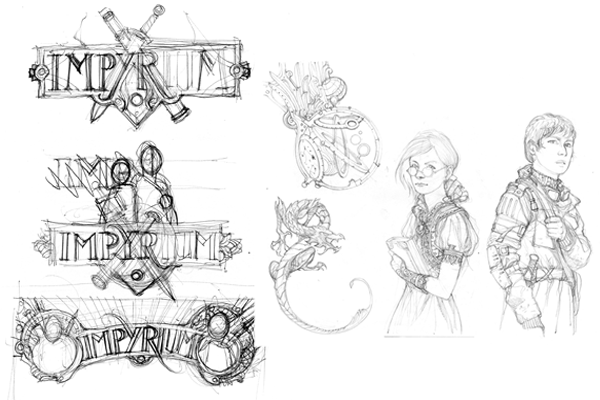
Typically when I do a cover illustration I start imagining scenes, like in a movie. They may come from the brief synopsis or the manuscript itself, depending on what the publisher can provide to work with. In a case like ‘Impyrium’ where I was creating the title and type work for the cover the approach is different , less specific, more wide, like a puzzle where you know you have to work on different parts at the same time and they must fit together in the end.
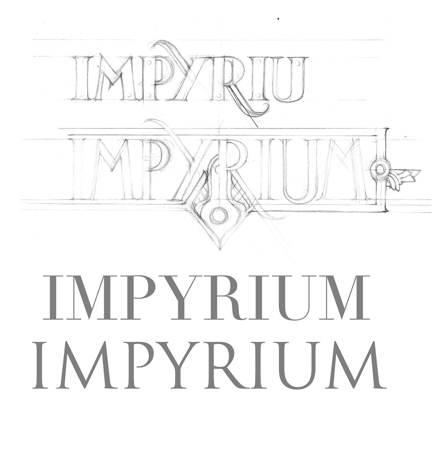 15. Typography is often an overlooked aspect of design. You did some really beautiful work developing IMPYRIUM’s logo. Could you share your thoughts and approach to its creation?
Working with type is a passion for me. I always start doodling on paper with general ideas of how the title treatment would look and then I start browsing typefaces that can inspire me. It is a time consuming process browsing through so many font types. The final title of Impyrium was drawn in Photoshop, effects and all.
16. One aspect of your work I really admire is your attention to detail. For example, the vault on IMPYRIUM’s cover is a work of art unto itself. Could you take us through the steps you used to create its roiling monsters, ship, and wonderful bronzed texture?
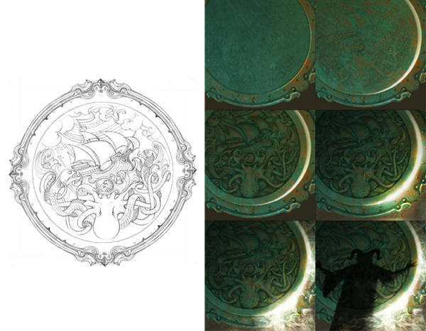
Well, everything was on the description really, I just needed to put all the elements together. It is a great element and working on it was fun. The most difficult part was the final rendering with all the textures and embossing, creating the old bronze effect took a few essays and tons of references before jumping on the final rendering.
17. IMPYRIUM is the first book in a trilogy. Do you approach a cover’s design differently if the book is part of a series? Do you develop a branded template with future books in mind?
Absolutely. I have to think on elements that surely will repeat on the next covers but I have to think in advance how they will look with a different illustration underneath or different colors.
18. How much input does the publisher’s art director typically provide? Does it tend to fall in certain areas, such as the color palette or central image? How do you interact with the art director throughout the process? Are you ever in touch with the author or editor directly?
Most of the time I work with the art director, not the author or editor, but the approach changes from one project to another. They usually provide a summary of the book as well as descriptions for the main characters but some art directors prefer to give me specific scenes or moments to work with while others just let me show my ideas to them. On these cases they provide the manuscript for me to read, which is something they sometimes can’t do depending on the level of confidentiality of the project. They also mention which images from my portfolio got their attention for that specific project.
19. When you’re not doing beautiful book covers, what other kinds of work do you do? Do you have a “dream” project you’d like to tackle some day?
I did concept art for an animated short film a few years ago and it was a fascinating experience, I would love to do it again sometime. I also would like to return to comics eventually. I have also played with the idea of doing concept art for video games, anything that involves telling stories.
20. What trait or quality do you think is absolutely vital to someone who wants to make a living as an artist?
Perseverance. It’s a long road and it usually requires a lot of patience to achieve things. I also insist in having an open mind. Everybody wants to design superhero book covers and characters but there are many other topics that many people disregard and can become tools of creativity and professional growth. In the past I did medical illustrations or created weather maps for school books and now I have had the opportunity to illustrate maps for fantasy book series.
21. What is something you wish you’d known when you were just starting out?
How to survive as an illustrator. I was well taught on the artistic part of this profession but on the business side, not too much. That I learned the hard way.
22. What is a film or book that every aspiring artist should study?
On the technical side of creation I would recommend ‘Color and Light’ by the fabulous illustrator James Gurney. Also, for composition, ‘Framed Ink’ by Marcos Mateu-Mestre. There is also this documentary ‘Jodorowsky’s Dune’, an interview with Alejandro Jodorowsky about the creation of his failed adaptation of ‘Dune’. A project about perseverance, open mind and personal search.
23. Where can we find more of your work?
Behance: https://www.behance.net/ajcaparo
Blog: http://antoniocaparo.blogspot.ca
or on Facebook: https://www.facebook.com/ajcaparo
24. Do you ever sell your sketches or originals? If so, how can we purchase them?
I am planning to set up a selling mechanism to do so but there is nothing ready yet. I will let everyone knows when it happens.
25. You live in Montreal but grew up in Cuba: Plantains or poutine?
A bit of both, but I also lived in Bogota, Colombia and Toronto, Canada so there are a few more ingredients to that mix, bon appetite!